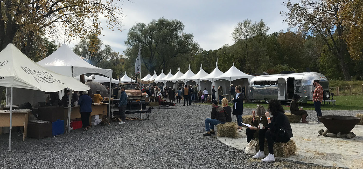
Introduction
Once a former brick manufacturer, Hutton Brickyards asked us to help create a logo to bridge its history with the elegant event venue it has become.
The Solution
Taking inspiration from the Hutton bricks for proportion, the logo emphasized the bucolic venue. To welcome visitors we extended the crossbar as invitation in an own-able way. To tie the brand to its industrial history, the bricks informed us in the color palette and with a variable H to support images.
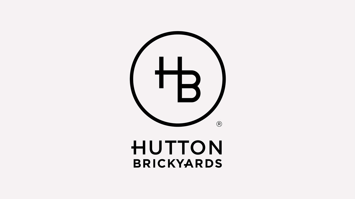


After a site visit to Hutton Brickyards, the brick crane’s structure inspired us to explore historic potter’s marks. This lead to the final inspiration for the logomark.


In the initial ideation phase, we explored multiple treatments of the HB ligature and developed our own stamps to test. Once a font treatment was reached, we built our own “HB” ligature based on the brick proportions.


The logo has three forms: the logomark, the vertical logo with the wordmark, and a horizontal configuration. To meet the needs of the client, a specific logo was developed for each of the subcategories of their event types. A neutral color palette and solid lines and rectangles were influenced by the venue’s industrial history but softened for more versatile use. A blocky and versatile “H” was used as a visual element to feature photos in a unique way.